Our Blog


Every great brand has one thing in common - a logo that speaks before anyone opens their mouth. Before a customer reads a single word about your company, before they experience your product or service, they see your logo. In that fraction of a second, a world of perception is built. For a business owner, understanding the science and strategy behind logo design is not optional - it is foundational.
A logo is the singular visual representation of everything
your company stands for. It
communicates your values, your personality, your promise - all without a single word.
Research shows that 75% of consumers recognize a brand by its logo alone
, making it the
most cost-efficient marketing asset a company can possess.
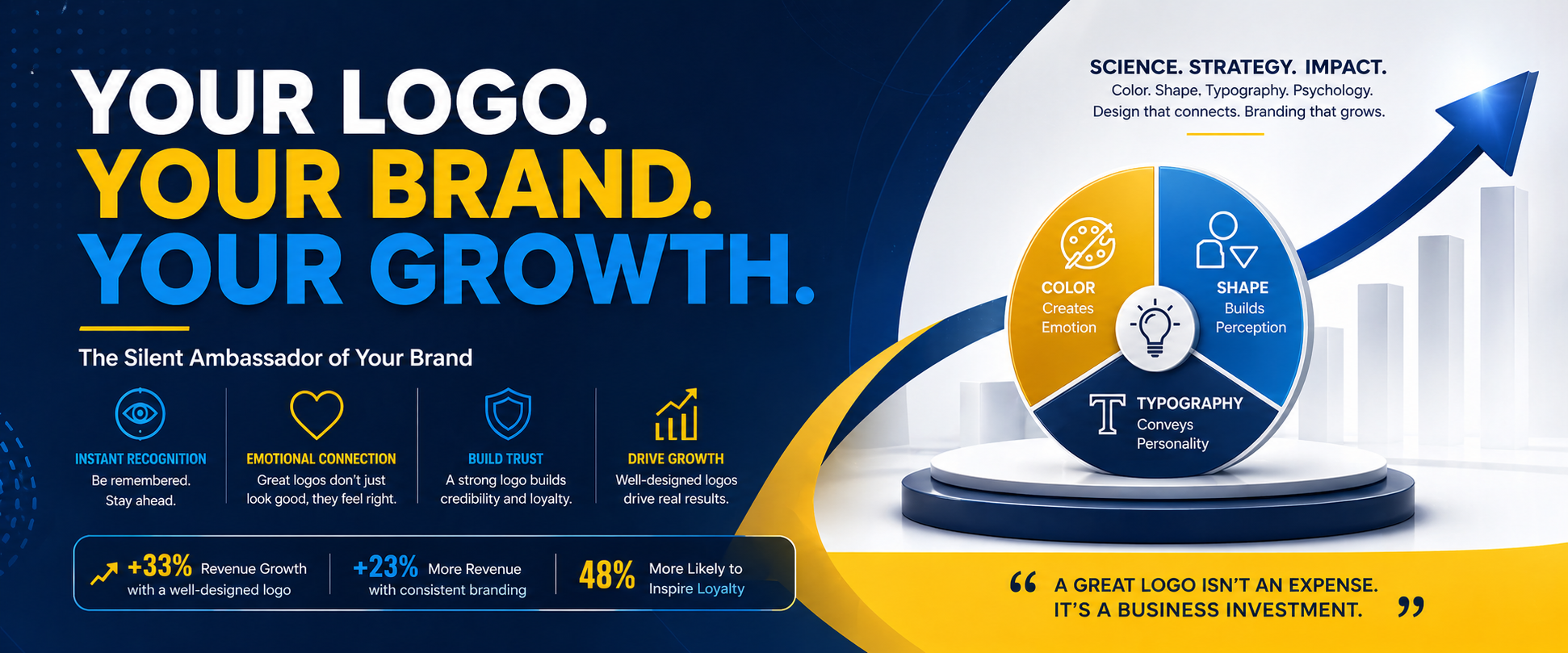
The numbers speak clearly. Companies with well-designed logos experience revenue growth
of up to 33% , while consistent branding built around a strong logo
can raise overall
revenue
by up to 23%. A powerful logo is not a design expense - it is a
business investment with
measurable returns.
The human brain processes visual information 60,000 times faster than text. Your logo triggers an almost instantaneous emotional and cognitive response in the viewer's mind. This is why professional logo design must go far beyond aesthetics - it must be strategically engineered.
A professionally designed logo achieves several critical objectives simultaneously:
• Instant Recognition - helps customers quickly identify the brand
among
competitors
• Emotional Connection - colors, shapes, and typography evoke specific
emotions
• Brand Consistency - provides a foundation across all marketing
materials, from
websites to packaging
• Credibility and Trust - a polished logo signals professionalism and
reliability
Studies confirm that a well-designed logo is 48% more likely to inspire brand loyalty among consumers, and companies with robust logo design are 27% more likely to attract new talent - a benefit that extends well beyond customer acquisition.
Modern research has moved beyond intuition. A 2025 study published in Behavioral
Sciences combined advanced neuroscience technology with cognitive survey methods to
analyze how logo designs activate emotional responses and shape brand perception. The
findings confirm that logos stimulate the brain's emotional center, not just the
rational
decision-making cortex - meaning people feel your brand before they think about it.
This is a critical insight: consumers primarily use emotions rather than
logic when
evaluating brands. A logo that elicits the right emotional response can directly and
positively
influence purchasing behavior. This is why a scientific approach to design - grounded in
color psychology, shape symbolism, and visual hierarchy - is not merely an artistic
exercise
but a business strategy.
| Color | Psychological Effect | Best Suited For |
|---|---|---|
| Red | Energy, urgency, passion, excitement | Food, retail, sports, entertainment |
| Blue | Trust, calm, professionalism, reliability | Finance, technology, healthcare |
| Green | Growth, balance, nature, sustainability | Eco-brands, wellness, finance |
| Yellow | Optimism, clarity, warmth, happiness | Retail, food, consumer goods |
| Black | Sophistication, luxury, authority | Premium, fashion, high-end brands |
| Orange | Creativity, enthusiasm, friendliness | Startups, food, media |
| Purple | Wisdom, royalty, creativity | Beauty, luxury, education |
| White | Purity, simplicity, clarity | Healthcare, tech, minimalist brands |
Color is the single most powerful psychological lever in logo design. Research shows that color activates the brain's emotional center, and specific hues trigger consistent emotional and behavioral responses across cultures.
Here is how the major colors work scientifically in brand identity:
A warm colors combination (red, yellow, orange) drives impulse purchasing behavior, while muted and cool tones (blue, green) foster long-term trust and engagement. The key rule: limit your logo palette to 2–3 colors for visual cohesion and maximum psychological impact.
Color combinations carry their own science too:
• Multicolor schemes appear youthful and energetic - ideal for
children's or lifestyle
brands
• Black and whiteprojects classic sophistication and maturity
• Monochromatic schemesprovide a unified, premium feel
• Neutral + accent colorharnesses the emotional power of a
single vibrant hue
without visual noise
While color speaks to emotion, shapes communicate personality and trust. Shape psychology in logo design is a well-established discipline - every geometric form carries deeply rooted psychological associations:
A landmark study published in the International Review of Management and Marketing confirmed that logo shapes directly influence brand loyalty and repurchase intentions, with brand attitude acting as a significant mediator. In simple terms: the wrong shape can make customers disengage, while the right shape deepens their loyalty.
The choice of typeface in your logo completes the trifecta of scientific logo design. Typography is not about which font looks attractive - it is about what the font communicates subconsciously:
An analysis of Interbrand's Top 100 Global Brands
revealed that
the most successful
logos
are deliberately engineered using four primary logotype strategies - shape-only
logos,
wordmarks, lettermarks, and combination marks - with each choice strategically
aligned
to
the brand's market positioning. None of these logos were designed by
accident. Every
curve,
every color hex value, and every typeface weight was a calculated decision.
Coca-Cola's red triggers excitement and appetite. Facebook's blue builds
trust
and calm
connectivity. McDonald's golden arches are yellow for happiness and optimism
-
deliberately designed to stimulate the reward center of the brain. These are not
coincidences; they are science in action.
For skeptics who view logo design as a luxury, consider these data points:
• Consistent logo display across platforms correlates with a 23%
increase in
revenue
• Companies with well-designed logos may experience up to 33% revenue
growth
• Logo redesigns correlate with an average 11% revenue growth
in the
first year post-
launch
• Businesses using logos effectively on social media see a 13% increase
in
brand
awareness
• 60% of companies report that consistent branding added
10–20% to
their revenue
growth
These figures make a compelling case: a professionally designed, scientifically
informed
logo
is one of the highest-ROI investments a growing company can make.
When briefing a designer or evaluating a logo, apply this scientific framework:
1. Define your brand personality first - Are you trustworthy,
energetic, premium,
playful, or innovative?
2. Choose colors that align with your target audience's
psychology - Not just what
looks nice
3. Select shapes that reinforce your brand promise - Curves
for
warmth,
angles for
precision
4. Pick typography that matches your era and positioning -
Serif for
legacy, sans-serif
for modernity
5. Test across scales - Your logo must work on a billboard and
a
mobile favicon
equally
6. Limit complexity - The best logos in the world are simple,
scalable, and timeless
7. Consider cultural context - Colors and symbols carry
different
meanings across
regions and markets
A logo is not a decoration. It is a strategic business asset
- one
that works 24 hours a
day,
365 days a year, across every touchpoint your brand occupies. When designed with
scientific intention - with deliberate color psychology, shape symbolism, and
typographic
reasoning - it becomes the most powerful silent salesperson your company has.
In a competitive marketplace, the brands that grow are the brands that are
remembered.
And the first thing that makes a brand memorable is almost always its logo.
"Design is not just what it looks like and feels like. Design is how it
works."
- Steve Jobs
Invest in your logo not as a cosmetic exercise, but as the cornerstone of your
company's
identity, trust, and growth.
